This is the our finished opening sequence, we have exported it from premiere pro as a HD video, and uploaded it onto video sharing website YouTube( https://www.youtube.com/watch?v=xKxQ4TmyoS0)
Showing posts with label CONSTRUCTION. Show all posts
Showing posts with label CONSTRUCTION. Show all posts
Friday, 14 March 2014
Sound Mix
When Editing our project, we realised that it was necessary to edit the volume levels of individual clips throughout the sequence in order to create a professional sounding opening. We used the volume and denoiser audio effects in order to correct the sound in particular shots, lowering background noise when necessary to make the dialogue clearer.
 |
| Using Audio effects to improve sound in one of the shots |
Music
Initially we were going to use this royalty free music from a website we found online
During editing of the final cut we decided that this music was more appropriate because it connotes the thought-provoking indie atmosphere that we are trying to create.
During editing of the final cut we decided that this music was more appropriate because it connotes the thought-provoking indie atmosphere that we are trying to create.
Wednesday, 12 March 2014
Titles
Between our test edit and real edit, we made changes to the look of the titles, using our titles reference point- Somers Town, to guide our choices.
We wanted our titles to be subtle as not to distract from the action and to connote the naturalistic themes of the film, but in doing this they vanished off the page and were easily missed.
The titles in Somers Town achieve what we were aiming for- they are subtle but still stand out against the footage. The font size is smaller then ours but the use of capitals and bold, makes it more effective.
Therefore we took this into consideration when reconstructing our title sequence, we kept the same font, but reduced the size and made it bold. we also decided to keep the titles in either the bottom right or left of the shot, like Somers Town, as we found this was less distracting for the audience.
 |
| Our titles in our test edit. |
 |
| Somers town Title reference |
 |
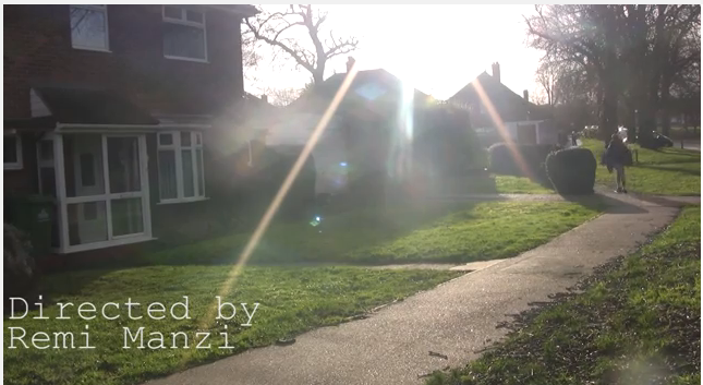
| Titles from our main edit |
Tuesday, 11 March 2014
Colour Grading
When grading our footage, we wanted to achieve a gritty urban look similar to that of the TV show Misfits. To achieve this, all bright colours were dulled. This meant keeping the saturation, contrast and brightness low. We used Procamp and Three-way colour corrector to grade our shots.


 |
| The colour of the jumpsuits before grading |
 |
| Scene once graded |
Subscribe to:
Posts (Atom)