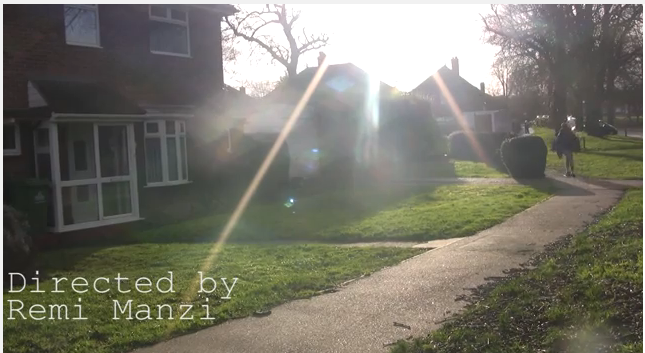
We wanted our titles to be subtle as not to distract from the action and to connote the naturalistic themes of the film, but in doing this they vanished off the page and were easily missed.
The titles in Somers Town achieve what we were aiming for- they are subtle but still stand out against the footage. The font size is smaller then ours but the use of capitals and bold, makes it more effective.
Therefore we took this into consideration when reconstructing our title sequence, we kept the same font, but reduced the size and made it bold. we also decided to keep the titles in either the bottom right or left of the shot, like Somers Town, as we found this was less distracting for the audience.
 |
| Our titles in our test edit. |
 |
| Somers town Title reference |
 |
| Titles from our main edit |
No comments:
Post a Comment